Making Communication Patterns Visible
A tablet-first dashboard that helps teachers reflect on tone, balance, and outreach over time.
Role: UX/UI Designer
Timeline: 5 weeks
Tools: Figma, FigJam, Lyssna
Product: Echo Insights (MVP Concept)
Scenario
When communication is constant — but patterns are invisible
Teachers communicate with families daily. Messages are sent through ClassDojo, TalkingPoints, email, and Infinite Campus. Each platform stores message history, but none surface communication patterns.
Across interviews with five K–12 teachers, one tension became clear: teachers could retrieve messages, but they could not easily see:
Frequency over time
Tone distribution
Positive vs. corrective balance
Which families had not been contacted recently
This made reflection reactive and not proactive. It happened during grading cycles, parent complaints, or documentation requests.
The activity was there. The visibility was not.
Problem
Communication platforms store messages — but they don’t reveal patterns.
Teachers already have tools for sending messages, but those tools were not designed to help them step back and understand their communication patterns. As a result, several structural challenges emerged.
The challenge was not increasing communication. It was helping teachers see the patterns within the communication they were already having.
Pattern Blindness
Logs display timestamps, not trends. Teachers cannot quickly assess weekly outreach balance or identify communication gaps.
Fragmented Documentation
Positive updates live in one tool. Formal logs live in another. Teachers manually reconstruct communication history when proof is needed.
Reactive Awareness
Communication review occurs after a conflict or concern. There is no built-in moment for proactive self-checking.
Equity Without Data
Teachers value fairness, yet no system visually shows distribution of outreach across students and families.
Process
Designing a system that turns communication activity into insight
Before designing anything new, I needed to understand how teachers currently manage family communication and where visibility gaps exist. I conducted interviews with five K–12 teachers to learn how they reviewed message history, tracked outreach, and prepared communication documentation.
Investigating How Teachers Track and Reflect on Family Communication
Investigation revealed two consistent patterns for consideration.
Teachers relied heavily on memory and scrolling through message logs to determine when they last contacted family.
As I synthesized the interviews, a broader insight emerged: teachers did not need another messaging platform.
They needed a way to see communication patterns across the tools they were already using.
Before designing a full interface, I needed to understand how teachers expected communication insights to be structured.
I created low-fidelity dashboard layouts and conducted unmoderated navigation testing using Lyssna. Teachers clicked through simplified screens and explained where they would go to complete common tasks.
Testing Early Navigation Concepts with Low Fidelity Prototypes
This early test focused on understanding:
how teachers expected communication information to be organized
whether the class overview and student details viewsfelt intuitive
where participants naturally looked for communication history and patterns
The results helped confirm that teachers expected communication:
at a class-level overview to scan communication activity
at a student-level detail view to review communication history
This confirmed that communication insights should be organized around class patterns and individual student timelines.
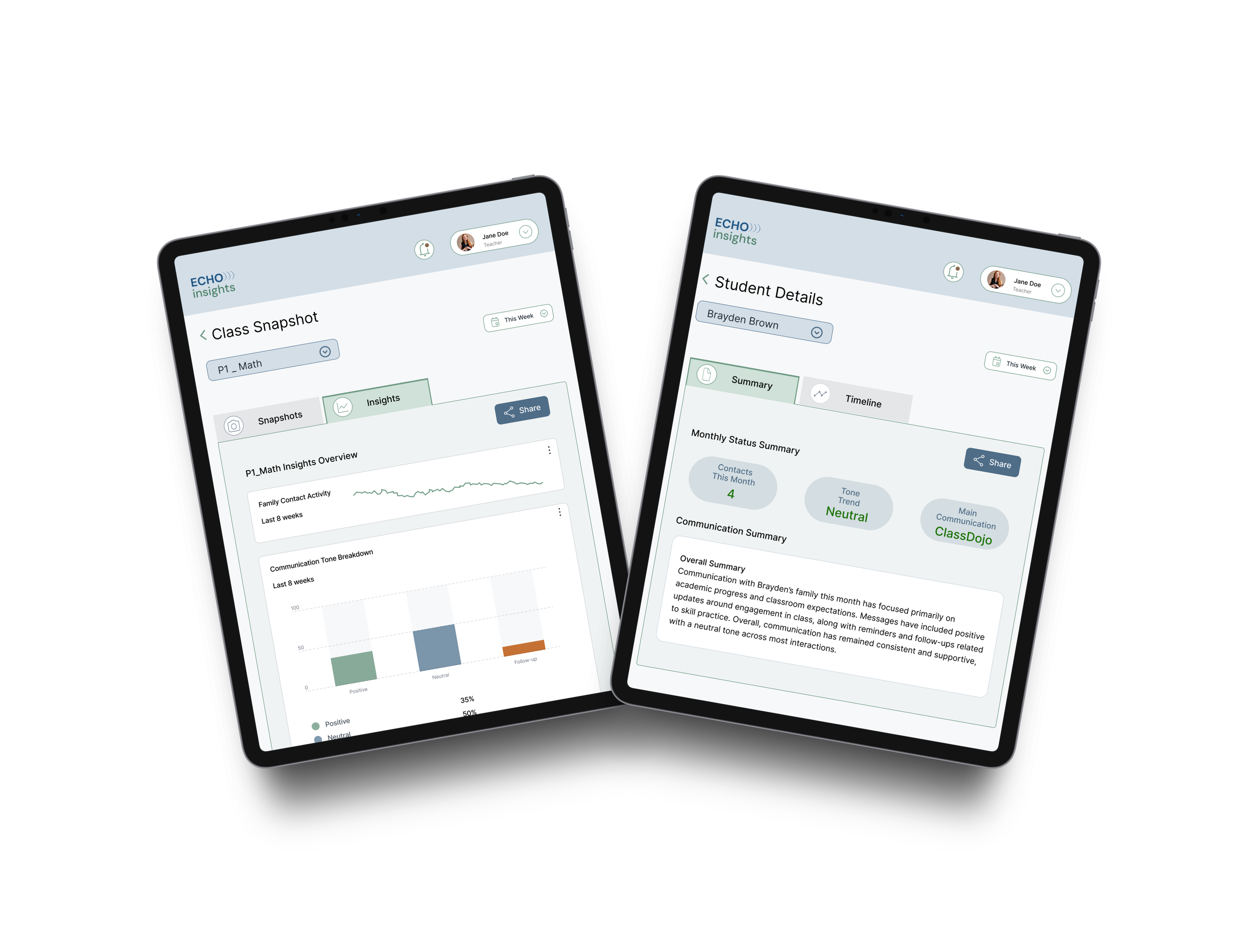
With the navigation structure validated, I translated the concept into a clickable high-fidelity prototype. The prototype introduced a dashboard designed to help teachers quickly interpret communication activity.
Translating Communication Insights into a Testable Dashboard
A Share workflow for exporting communication summaries
The prototype included:
Classroom dashboard cards showing communication activity for each class
Because the project simulated insights pulled from multiple platforms, the interface used simulated communication data to represent activity across tools. At this stage, the focus shifted from structure to clarity, ensuring teachers could interpret communication patterns quickly and move easily between views.
Evaluating the Dashboard Through Moderated Usability Testing
Overall Synthesis
Users want clarity in knowing what happens to their information
Users wants to understand the change of something over time
Users accurately can wayfind to critical information
With the high-fidelity prototype built in Figma, I conducted moderated usability testing sessions with teachers to observe how they interacted with the dashboard in real time.
During each session, participants were given short scenarios and asked to navigate the prototype while describing their thought process. Observing participants live allowed me to understand where teachers expected to find information, how they interpreted the visualizations, and where small points of friction appeared.
Participants completed tasks such as:
locating a student’s communication history
finding the student communication summary
Communication platforms stored messages, but none revealed patterns across time, tone, or students.
A student-level communication timeline showing when families were contacted
identifying where communication documentation could be shared
Common User Sentiment
“straightforward”
“self-explanatory”
viewing communication insights and trends
switching between class dashboards
Ease of Use Rating
4.5 out of 5
with 5 being “Easy” and 1 being “Difficult”
Watching participants move through these tasks revealed that teachers could successfully navigate between class-level and student-level views, but also highlighted areas where visual hierarchy and terminology clarity could be improved.
Task Success Rate
100%
Across the board
Key Findings
Observing teachers navigate the prototype revealed that the overall dashboard structure aligned well with how they expect to review communication activity.
Participants successfully moved between class-level and student-level views, indicating that the navigation hierarchy was intuitive.
Teachers quickly understood the communication tone visualizations, correctly interpreting the difference between positive, neutral, and corrective outreach.
Participants described the unified communication history as useful when preparing for conferences or documenting outreach.
The main friction point appeared in the sharing workflow, where the term Export created uncertainty about whether the information would be downloaded or sent to someone.
Tone visualization graphs displaying positive, neutral, and corrective communication
Iteration
Clarifying sharing and strengthening the dashboard hierarchy.
To reduce confusion around saving and sending communication summaries, I refined the sharing workflow so teachers could clearly understand how to document communication records.
Based on feedback, I made the following refinements :
Renamed Export to Share to better reflect how teachers are expected to share out communication
Simplified the share menu options to reduce decision friction
Clarified labeling for communication summaries
After - Conditional Highlighting through Share Interaction
Before - Share Interaction
Strengthening Dashboard Hierarchy
To make communication insights easier to interpret at a glance, I strengthened the visual hierarchy of the dashboard.
Based on feedback, I made the following refinements:
Increased the size of the class dashboard cards so teachers could more quickly identify and select the class they wanted to review.
Before - Dashboard
Enlarged the class icons displayed on each card so communication alerts and activity indicators were easier for teachers to notice at a glance.
After - Enhanced Card Visibility for Faster Class Scanning Dashboard
Improving Communication Status Indicators
Clear communication signals help teachers quickly interpret family outreach patterns when reviewing a student’s history. Feedback indicated that the status indicators within the Monthly Status Summary could be visually clearer and better aligned with common UI color expectations.
Based on feedback, I made the following refinements:
Updated the communication tone status color from orange to green to better reflect a neutral or stable communication pattern and reduce potential misinterpretation.
Improved the visual distinction of status indicators within the Monthly Status Summary so teachers can more quickly understand tone and outreach activity at a glance.
Before - Status Indicators
After - Improved Status Clarity and Contextual Sharing
Moved the Share action into the active tab container so the sharing action clearly corresponds with the content being viewed.
Impact
Transforming communication records into actionable insight.
Echo Insights demonstrates how communication activity that already exists across multiple platforms can be transformed into meaningful insight for teachers. Instead of relying on memory or scrolling through message histories, teachers can view communication patterns across time, tone, and students within a single dashboard.
The final prototype enables teachers to:
review student-level communication timelines
generate and share communication summaries when documentation is needed
recognize patterns in outreach tone and frequency
scan communication activity across an entire class
By bringing communication history and insight together in one place, the dashboard helps teachers move beyond simply sending messages toward understanding how communication is distributed across families and students.
Although the project is conceptual, moderated usability sessions showed that teachers could quickly interpret the dashboard structure and navigate between class-level and student-level views.
Reflection
Designing for awareness, not just action.
This project reinforced how valuable information already exists within the tools teachers use every day. The challenge is not sending messages, but it’s understanding the patterns within that communication.
Through interviews and usability sessions, I saw how quickly teachers recognized the value of seeing communication activity summarized visually. When outreach patterns become visible, teachers can more easily reflect on how consistently they are connecting with families across their classrooms.
This project also strengthened my approach to iterative design. Early navigation testing helped validate the information structure before investing in a full interface, and moderated usability sessions revealed how small adjustments in terminology and visual hierarchy can significantly improve clarity.
In future iterations, I would explore how communication insights like these could integrate directly with existing classroom tools so teachers could gain visibility into outreach patterns without switching between platforms.