From Static PDFs to Intuitive Access
Designing a mobile-first sanitation dashboard feature for DeKalb County residents.
Role: UX/UI Designer
Timeline: 4-5 weeks
Tools: Figma, FigJam
Product: DeKalb Sanitation (Add a Feature)
Scenario
When information exists — but isn’t easy to access
Accessing essential public services should feel simple. DeKalb County provides sanitation services, including weekly pickup, bulk item scheduling, and hazardous waste guidance. The information was technically available online, but critical updates, especially holiday pickup changes, were primarily delivered through downloadable PDFs.
For residents relying on their phones, this meant zooming, scrolling, and navigating documents that weren’t designed for mobile use. The issue wasn’t missing information. It was how that information was delivered.
Problem
Residents could find sanitation information — but not in a way that supported quick, everyday use.
The county website contained the information residents needed, but the experience wasn’t designed around how people actually access public services. Important details like collection schedules and service guidelines were distributed through static documents rather than interactive tools.
Without a clear entry point or mobile-friendly structure, residents often had to search through multiple pages or documents to confirm simple information like pickup dates or service rules. These structural gaps made routine tasks more time-consuming than they needed to be.
Information Lived Inside PDFs
Holiday pickup dates were delivered through a downloadable calendar rather than presented directly within an interactive webpage.
The Experience Was Not Mobile-First
Most residents relied on their phones to check schedules, but the interface wasn’t structured around mobile behavior, making essential tasks harder than they needed to be.
Accessibility Gaps Created Barriers
Color contrast issues and limited support for screen readers reduced clarity for users who needed quick answers.
Services Were Scattered
Pickup schedules, bulk requests, and disposal guidance were not centralized, requiring multiple navigation steps instead of a unified experience.
Process
Transforming scattered sanitation information into a clear, mobile-first service experience
Understanding How Residents Actually Access Services
Before designing anything new, I needed to understand how residents were currently navigating sanitation information and where friction was occurring. I conducted moderated interviews with DeKalb residents and nearby county residents who experienced similar systems.
Two consistent patterns emerged:
Residents primarily relied heavily on their phones to check sanitation schedules.
Holiday pickup information required opening long PDFs that were difficult to navigate on mobile.
As I synthesized the interviews, a broader insight emerged: residents wanted a centralized place to manage sanitation services, rather than relying on documents or scattered pages.
Expanding the Concept Beyond Holiday Schedules
Originally, the scope focused on improving access to holiday pickup changes. However, interview insights revealed a broader need. Residents weren’t just looking for a date — they were looking for clarity across multiple sanitation services.
This led to the concept of a centralized sanitation dashboard that could bring key services together in one place, including personalized pickup schedules, bulk-item pickup, hazardous-waste guidance, and bin-management information.
I began exploring this concept through hand-drawn sketches, structuring the dashboard using a tile-based layout to keep decisions simple and scannable on mobile.
Concept Validation
To test the idea before moving into higher-fidelity design, I conducted moderated think-aloud sessions with participants using the sketches.
Task Success Rate
100%
For core scheduling flow
Participants were asked to complete two common sanitation tasks:
Checking whether a holiday impacted their pickup schedule
Scheduling a bulk item pickup
Key observations:
Participants quickly gravitated toward entering their service address to locate pickup information.
One participant initially found the “My Collection Schedule” button placement slightly unclear.
Service address entry to identify the resident’s location
The bulk pickup flow was easy to follow, including reviewing rules, selecting items, and confirming the request.
A participant also questioned how the system would handle bulk items not included in the preset list.
These sessions confirmed that the address-based approach felt intuitive, while highlighting opportunities to refine navigation clarity and service flexibility before designing the prototype.
Early Dashboard Concept Sketches
Designing an Address First Workflow
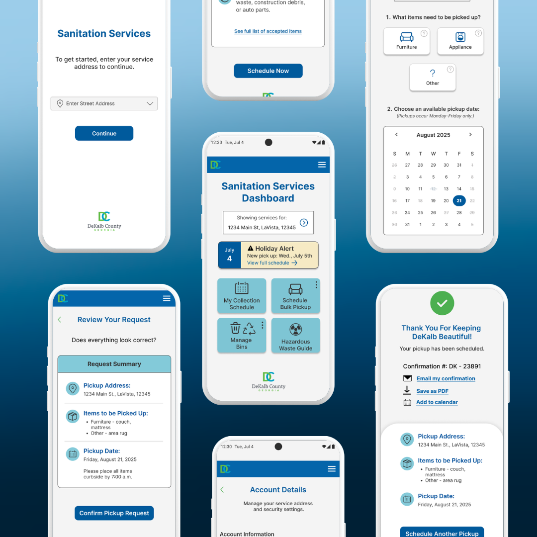
Insights from the sketch validation informed the structure of the first interactive prototype. Because sanitation services vary by address, personalization needed to begin there. I designed an address-first workflow, prompting residents to enter their service address before accessing pickup schedules and sanitation services.
This approach ensured that residents could quickly see location-specific pickup information and available services without navigating multiple pages.
The prototype focused on:
Location-specific pickup schedules and services generated after the search
A dashboard layout organizing sanitation tasks into clear service tiles
Testing the Address-First Workflow with Residents
Before refining the design, I conducted moderated usability testing with five participants to evaluate how effectively the address-first flow supported real user behavior. I wanted to understand whether residents could quickly access holiday schedule information and complete a bulk pickup request without confusion.
What Participants Were Asked To Do:
Checking for holiday pickup schedule changes
Scheduling a bulk item pickup from start to finish
Key User Behavior
User scan for action-oriented buttons
instead of reading instructional text
Ease of Use Rating
4.5 out of 5
easy to use once inside the flow
Entering their address
Observing participants navigate the prototype allowed me to understand how residents approached the entry point, where they expected to find information, and where friction appeared.
Primary Fiction Point
80%
Failed at the entry point
Key Findings
The issue was not the bulk pickup or scheduling flow itself, but the hierarchy of the entry experience. Users were not clearly guided to begin by entering their address.
This revealed an important behavioral pattern: users scan for action-oriented buttons rather than reading instructional text.
These findings informed the next iteration, focusing on clarifying the entry point and improving visual hierarchy so residents could immediately recognize the intended first step.
Overall Synthesis
Users need clear guidance at the entry point
Users rely on visual cues over instructions
Once inside, users can complete tasks without friction
Clear hierarchy is critical to prevent early drop-off
Iteration
Refining the entry experience, dashboard clarity, and confirmation flow based on usability testing insights.
Refocusing the Landing Experience
To better guide users through the first step, I simplified the landing page and made the address field the clear starting point.
Based on feedback, I made the following refinements:
Revised the supporting text to clearly communicate the required first step.
Clarified the onboarding message to reinforce that an address must be entered before continuing.
Before - Landing Page
Tightened the guidance text to align with the updated CTA.
Simplified the instructional message to make the next action explicit.
After - Clarified Guidance on the Landing Page to Make the First Step Explicit
Clarifying the Dashboard
To reduce confusion and improve task clarity, I refined dashboard labeling and strengthened the visual hierarchy of key information.
Introduced kebab menus for consistent secondary actions
Based on feedback, I made the following refinements:
Renamed “Disposal Guide” to “Hazardous Waste Guide”
Strengthened holiday alert visibility
Updated iconography to reduce confusion
Before - Dashboard
After - Improved Dashboard Clarity through Stronger Hierarchy and Labeling
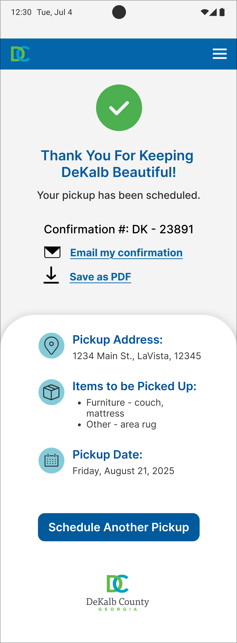
Strengthening Confirmation & Follow-Through
To strengthen follow-through after scheduling a pickup, I enhanced the confirmation experience so residents could more easily keep records of their scheduled service. This ensured residents could keep records in the format that worked best for them.
Based on feedback, I introduced the following refinement:
Added an “Add to Calendar” option so residents could easily save their pickup date alongside existing confirmation options.
Before - Confirmation Screen
After - Improved Follow through on Confirmation Screen with Flexible Save Options
Impact
Making sanitation services easier for residents to access and navigate on mobile.
The final prototype created a clearer, mobile-first sanitation experience grounded in real user behavior. Designing around real user behavior led to meaningful improvements such as:
Finding pickup schedules faster by reducing unnecessary navigation steps
Seeing time-sensitive updates clearly, including holiday schedule changes
This project reinforced that designing around how residents actually interact with public services can significantly improve clarity and usability—without requiring a full system redesign.
Accessing key sanitation services in one place through a centralized dashboard
Navigating the experience more easily through improved visual hierarchy
Reflection
Improving public services through clarity, not complexity.
This project reinforced the importance of clarity in public-facing systems. Residents didn’t need more content — they needed easier access to the information that already existed.
Designing for mobile required intentional prioritization and restraint. By focusing on how residents actually search for sanitation services, I was able to restructure the experience around clear entry points and simplified navigation.
The process also reinforced the value of early testing and iterative refinement. Even small adjustments to language, hierarchy, and visual cues significantly improved how easily users could complete key tasks.
This project demonstrated how thoughtfully designed features, grounded in real user behavior, can significantly improve residents’ access to essential public services.