From Limited Context to Clearer Decisions
Designing a more structured admin backend for moderation, review, and investigation.
Product Type: Responsive Web Admin Panel
Role: UX/UI Designer
Timeline: 5 weeks
Tools: Figma, FigJam, gap analysis spreadsheet, client feedback sessions
Product: NDA-Protected Beta Social Platform
Scenario
Designing structure for a backend that was still evolving
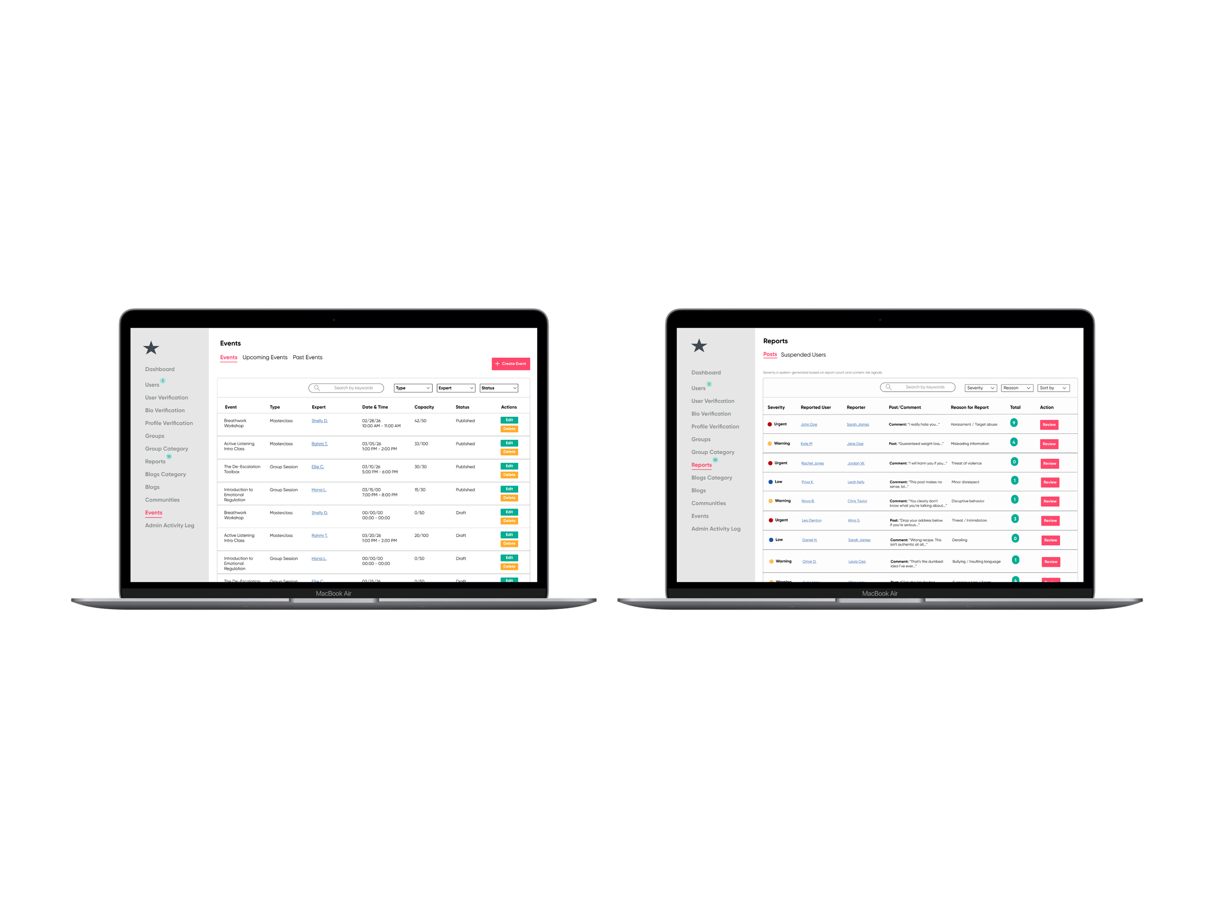
This project focused on the admin backend of a beta social platform. While the broader product already had established patterns, the backend needed a stronger structure, clearer visibility into moderation activity, and more complete support for admin tasks.
To understand the current state of the system, I first reviewed the backend across multiple screens and documented where the experience felt incomplete, inconsistent, or difficult to manage. That initial review helped define the scope of the work and revealed where the admin panel needed clearer organization and stronger screen-level support.
Problem
The backend supported review tasks, but not with enough clarity or consistency
The challenge was not simply adding more screens. The backend needed better support for how admins reviewed reports, understood user context, and tracked activity across the platform.
Missing Product Alignment
Some backend views did not reflect key fields or structures already established elsewhere in the platform. This created gaps between what existed in the product and what admins could actually review on the backend.
Incomplete Admin Context
Important details were missing or underdeveloped across the interface. That made it harder for admins to understand user history, moderator actions, and review decisions in one place.
Unclear Review Flow
Moderation tasks existed, but the experience lacked a strong visual hierarchy and a clear sense of progression. Admins needed a more structured way to move quickly between review actions and deeper investigation.
Evolving Product Scope
Because the platform was still in beta, client requests continued to shift as priorities changed. The design work needed to stay flexible while still creating a more stable and coherent backend. system.
Process
Turning a loose backend into a more structured admin system
After reviewing the backend at a high level, I took a closer look at the areas that created the most friction for admins. I used a more detailed gap analysis and heuristic review to identify the issues most directly affecting clarity, visibility, and decision-making.
This helped me move beyond a broad inventory of issues and begin prioritizing what needed the most attention first. It also created a clearer foundation for deciding which workflows, screen behaviors, and missing fields needed to be redesigned.
Looking more closely at where the backend was breaking down
Organizing backend requirements and workflow structure
Once I understood the major gaps, I mapped the backend into clearer workflow paths. I created a reports user flow and an admin activity task flow to define how admins would move through key parts of the system and what each screen needed to support.
Alongside those flows, I documented screen-level functions and triggers so the client’s development team had a clearer reference for how each backend view was intended to behave. This helped translate broad client requests into more concrete requirements and made the scope easier to organize.
Designing the core admin workflows
With the structure in place, I moved into wireframing the core backend experiences. I created mid-fidelity wireframes for the Admin Activity Log, Report Review Modal, Events Page, and User Profile / Investigation View to explore hierarchy, layout, and how information should be grouped across screens.
This phase focused on making the backend easier to scan and more intentional in how information was presented. Rather than treating each screen separately, I designed them as part of a connected admin system.
Refining the system through feedback and evolving scope
After establishing the core layouts, I translated the flows into high-fidelity screens and refined them based on client feedback. This included introducing the report queue, redesigning the review modal, and deciding where newer requests, such as AI summary content, fit best within the system.
One important decision was keeping the modal focused on review while moving deeper context into a broader investigation view. That helped preserve clarity between quick decision-making and more detailed analysis.
Key Findings
Reviewing the backend more closely made it clear that the strongest improvements came from clarifying where information lived and how admins moved through the system. When the structure became easier to scan, the backend also became easier to use.
Missing fields weakened the review process and made decisions harder to interpret
Stronger visual hierarchy improved how quickly information could be scanned
Some content, like AI summaries, worked better in an investigation context than inside a dense review modal
The backend worked best when designed as a connected system, not a set of isolated screens
Insights
This project reinforced that backend tools need more than functionality. They need structure. Once the workflows and information architecture became clearer, it was easier to decide what belonged in the queue, what belonged in the modal, and what required a deeper investigation view.
Designing the system this way made the interface feel more purposeful and easier to navigate. It also reinforced how much clarity depends on not just what a screen includes, but where that information appears in the overall system.
Iteration
Using feedback to expand and clarify the backend experience
Introducing a report queue for clearer report prioritization
As the reports experience evolved, the client requested a clearer way to view severity across incoming reports. In response, I added a report queue that gave admins a more structured way to review urgency and understand what needed attention first.
Based on client feedback, I added:
a dedicated report queue view
clearer visibility into severity and priority levels
stronger hierarchy to support faster review
Report Queue Added to Support Admins
Designing a review modal with clearer context and actions
The beta experience supported only a very limited review action, which did not provide enough context for stronger moderation decisions. In response, I designed a more complete review modal that gave admins clearer information about the report, the reported content, and the available next steps.
As the requirements became clearer through client feedback, it was also clear that not everything should live inside a modal. That led to adding a View Full History path so admins could move from a quick review into a broader user investigation view when more context was needed.
Based on the evolving requirements, I added:
a more detailed review modal with a stronger report context
clearer action paths for invalid, warning, and suspension decisions
space for moderation-related details, including reported content and history indicators
a View Full History path into the broader user profile/investigation view
Modal: Step One
Modal: Step Two
Modal: Step Three
Using the user profile to support deeper AI-based review
As the client began exploring AI summary content, one idea was to place that information inside the review modal. I recommended against that approach because the modal was already focused on helping admins make quicker decisions, and adding more detail there would have made the experience harder to scan.
Instead, I placed that information within the User Profile / Investigation View, where it could support deeper review without overcrowding the main moderation flow.
Based on the discussion, I recommended:
keeping the review modal focused on quicker decision-making
placing AI summary content within the User Profile / Investigation View
separating quick review from deeper analysis
using the broader profile view to hold richer user context
User Profile AI Insights Collapsed
User Profile AI Insights Expanded
Impact
Creating a clearer system for review, investigation, and action
The final design created a more structured admin backend that better supported moderation work. By aligning the backend more closely with the broader product, filling in missing details, and strengthening how information was organized across screens, the system became easier to interpret and more purposeful in how it supported admin decisions.
The final prototype enables admins to:
review reports with clearer priority cues
access stronger user and moderator context
move between quick review and deeper investigation
understand backend activity through clearer visual hierarchy
manage moderation workflows with more confidence and consistency
Because this project is protected by an NDA, the case study includes only selected and anonymized views. Even within those limits, the work reflects how a clearer structure can improve complex backend workflows.
Reflection
Designing backend systems starts with clarity, not polish
This project reinforced that strong product design often begins by clarifying structure before refining screens. I had to understand what the backend needed to support, where information was missing, and how admins would interpret what they were seeing before the interface could improve.
It also strengthened how I think about system design, feature placement, and the relationship between interface clarity and decision-making. The most valuable part of this work was turning shifting requests into a more coherent backend experience.
That process reinforced my approach to designing tools that are both functional and understandable.